


近期发现许多小伙伴有绘制K线图的需求,甚至有些同学没有用第三方模块自己写代码绘制图表,其实这完全是重复性工作,网上有许多已经成熟的K线图绘制方案,比如我们今天要讲的 Mplfinance.
Mplfinance 其实是 Matplotlib 组织开源项目的一部分。相对于Matplotlib,Mplfinance这个处于金融行业的垂直领域的模块的关注度确实是少了一些,以至于很多朋友都不知道它的存在,实际上它非常实用且好用。
1.准备
开始之前,你要确保Python和pip已经成功安装在电脑上,如果没有,请访问这篇文章:超详细Python安装指南 进行安装。
(可选1) 如果你用Python的目的是数据分析,可以直接安装Anaconda:Python数据分析与挖掘好帮手—Anaconda,它内置了Python和pip.
(可选2) 此外,推荐大家用VSCode编辑器来编写小型Python项目:Python 编程的最好搭档—VSCode 详细指南
Windows环境下打开Cmd(开始—运行—CMD),苹果系统环境下请打开Terminal(command+空格输入Terminal),输入命令安装依赖:
pip install --upgrade mplfinance
2.Mplfinance 基本使用
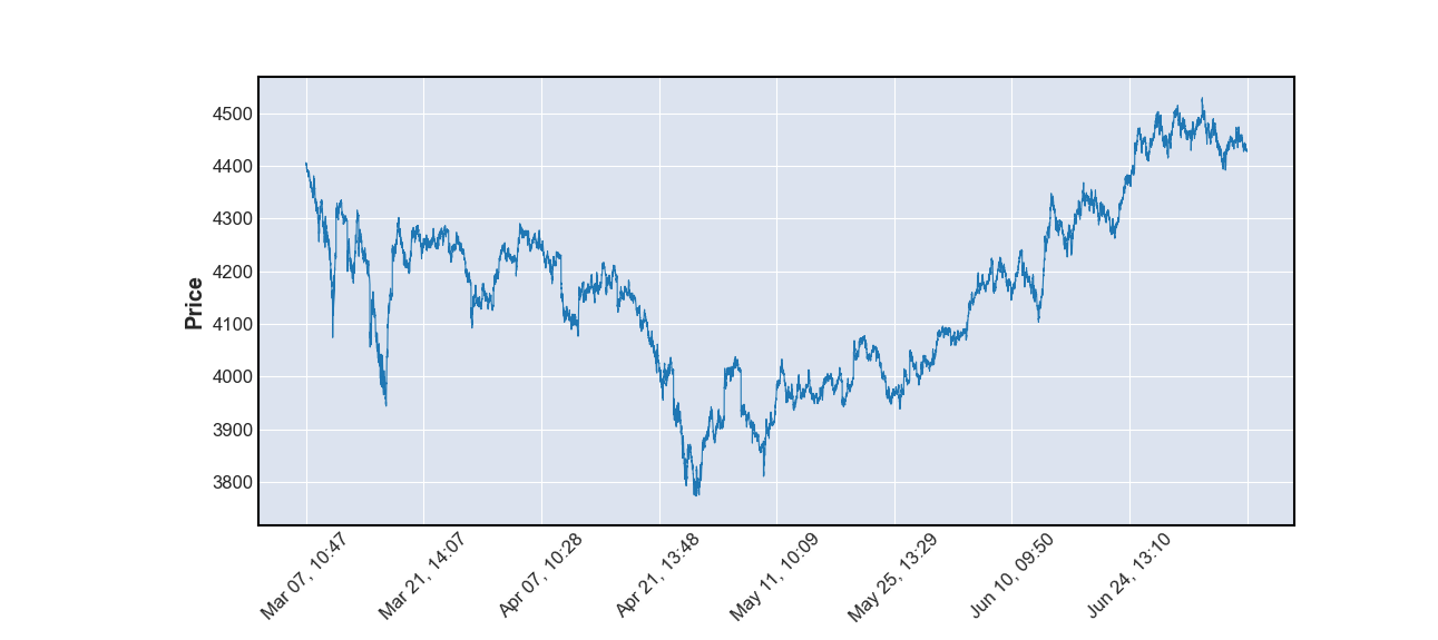
我们以沪深300分钟线为例,使用mplfinance绘制各类金融图形。
首先看看数据结构:
import pandas as pd
mins = pd.read_csv('sh300_1min.csv',index_col=0,parse_dates=True)
print(mins)
结构如下:
                       day      open      high       low     close     volume
0      2022-03-07 10:47:00  4406.223  4406.352  4405.662  4405.922   54345400
1      2022-03-07 10:48:00  4406.172  4406.175  4403.834  4403.918   70803100
2      2022-03-07 10:49:00  4403.333  4403.333  4402.235  4402.340   49632500
3      2022-03-07 10:50:00  4402.330  4402.519  4401.838  4402.519   48159200
我们用于mplfinance的数据必须是 Pandas DataFrame. 字段则按需提供,至少要有时间字段和一列数据。另外原始数据如果是其他的数据类型,你必须得先转成DataFrame格式。
此外,时间字段必须转为DatetimeIndex:
# 公众号:二七阿尔量化
import pandas as pd
import mplfinance as mpf
mins = pd.read_csv('sh300_1min.csv',index_col=0,parse_dates=True)
mins["day"] = pd.to_datetime(mins["day"])
mins = mins.set_index("day")
mins.index.name = 'Time'
print(mins)
效果如下:
                         open      high       low     close     volume
Time
2022-03-07 10:47:00  4406.223  4406.352  4405.662  4405.922   54345400
2022-03-07 10:48:00  4406.172  4406.175  4403.834  4403.918   70803100
2022-03-07 10:49:00  4403.333  4403.333  4402.235  4402.340   49632500
2022-03-07 10:50:00  4402.330  4402.519  4401.838  4402.519   48159200
准备完成后就可以绘制图表了:
# 公众号:二七阿尔量化
import pandas as pd
import mplfinance as mpf
mins = pd.read_csv('sh300_1min.csv',index_col=0,parse_dates=True)
mins["day"] = pd.to_datetime(mins["day"])
mins = mins.set_index("day")
mins.index.name = 'Time'
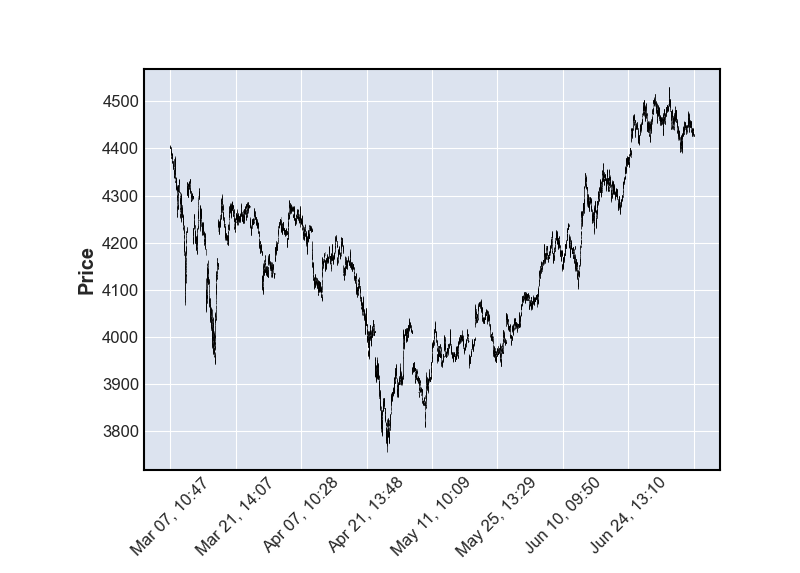
# 绘制默认图像(美国线)
mpf.plot(mins)
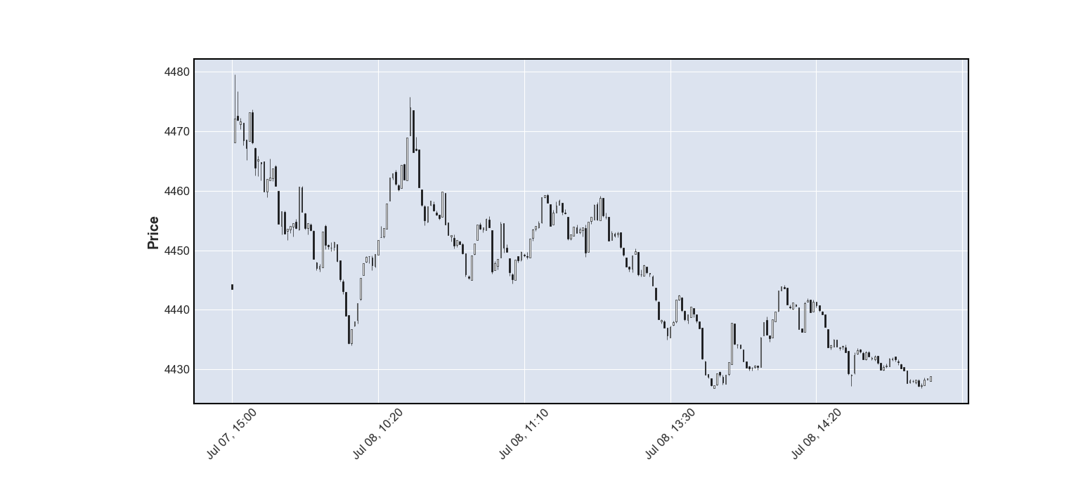
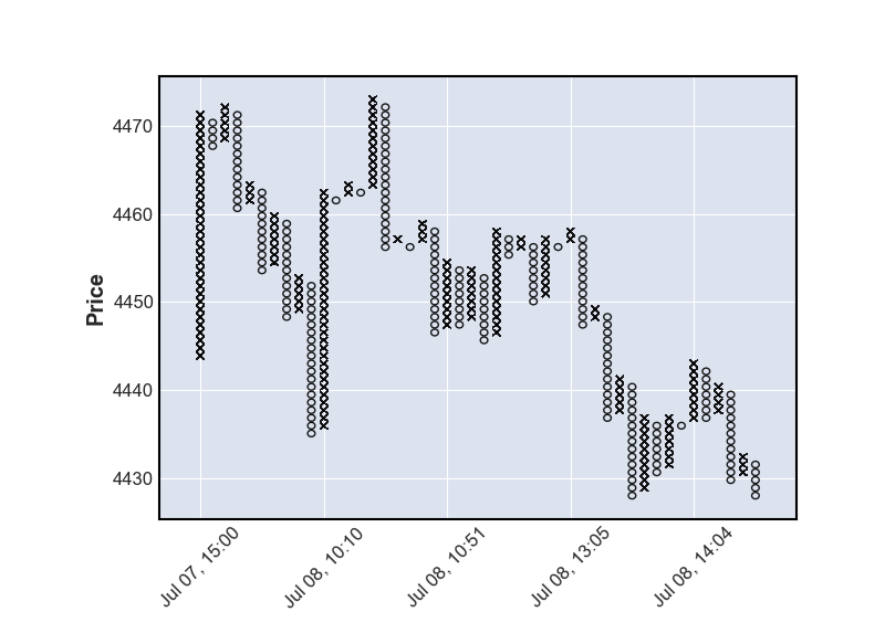
绘制蜡烛图(K线图),为了避免图表过大,我这里只取了240条K线:
# 公众号:二七阿尔量化
import pandas as pd
import mplfinance as mpf
mins = pd.read_csv('sh300_1min.csv',index_col=0,parse_dates=True)
mins["day"] = pd.to_datetime(mins["day"])
mins = mins.set_index("day")
mins.index.name = 'Time'

candle_chart = mins.tail(240)
mpf.plot(candle_chart, type='candle')

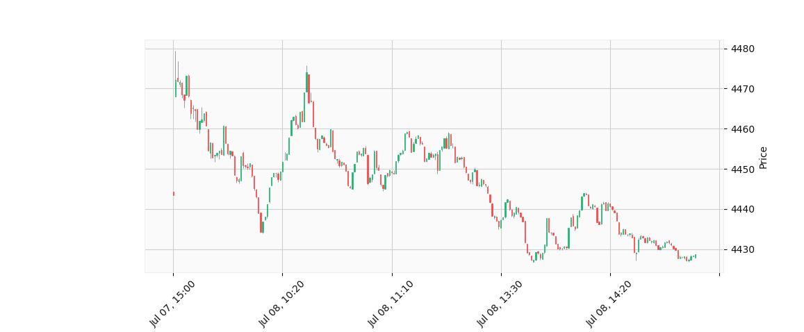
黑白颜色太单调了,我们可以换成“雅虎”配色:
mpf.plot(candle_chart, type='candle', style='yahoo')

绘制线型图:
# 公众号:二七阿尔量化
import pandas as pd
import mplfinance as mpf
mins = pd.read_csv('sh300_1min.csv',index_col=0,parse_dates=True)
mins["day"] = pd.to_datetime(mins["day"])
mins = mins.set_index("day")
mins.index.name = 'Time'
mpf.plot(mins, type='line')
除了美国线、蜡烛图(K线)、线型图外,mplfinance还支持 renko、pnf 等图形。有兴趣的同学可以改个type看看效果:
3.添加技术指标
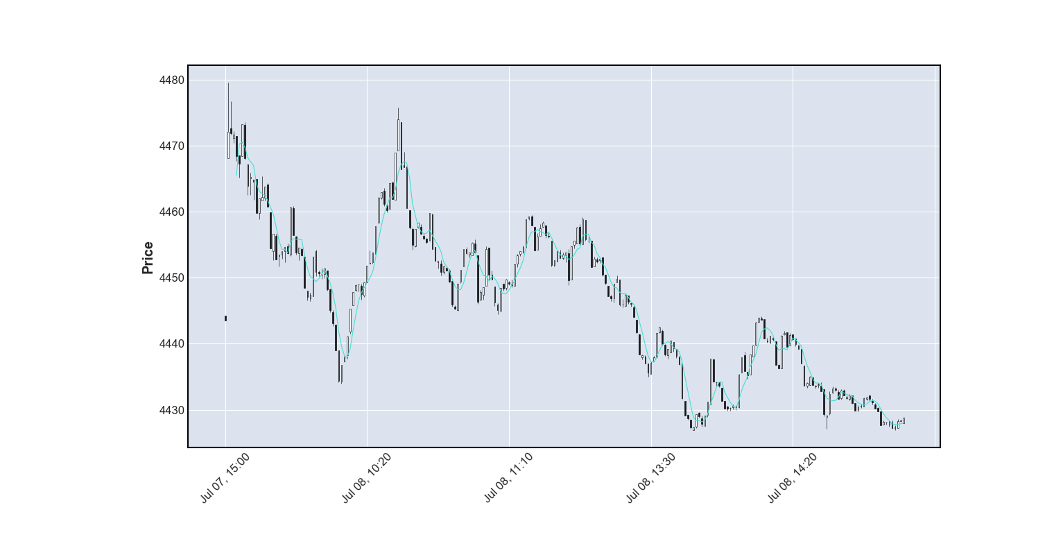
绘制简单移动平均线MA5,我们只需要多加一个参数:
# 公众号:二七阿尔量化
import pandas as pd
import mplfinance as mpf
mins = pd.read_csv('sh300_1min.csv',index_col=0,parse_dates=True)
mins["day"] = pd.to_datetime(mins["day"])
mins = mins.set_index("day")
mins.index.name = 'Time'
candle_chart = mins.tail(240)
mpf.plot(candle_chart, type='candle', mav=5)

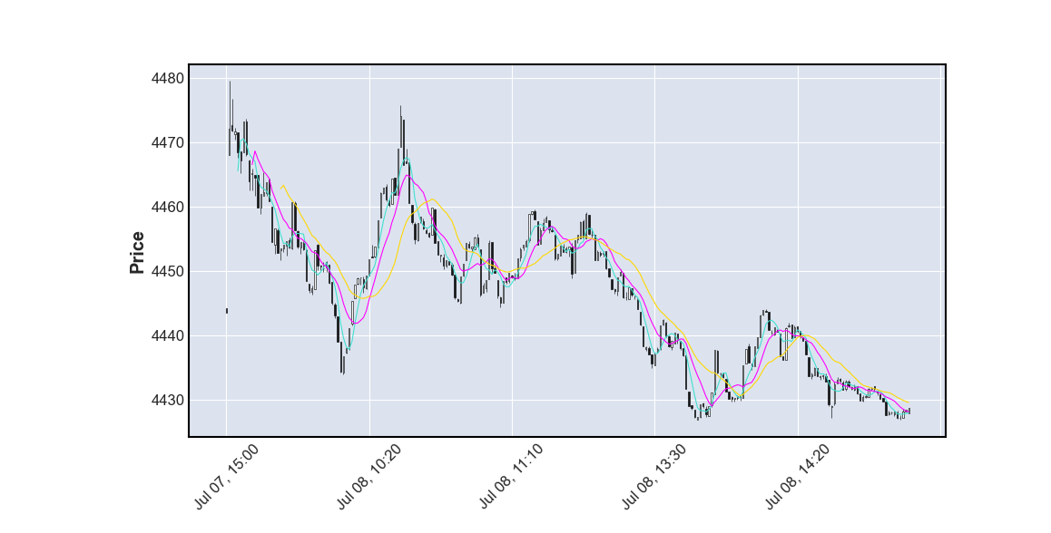
如果你需要多条移动平均线,只需要将mav改为元组参数,传入你需要的周期参数:

如果你还需要显示成交量(volume), mplfinance 也能实现:
# 公众号:二七阿尔量化
import pandas as pd
import mplfinance as mpf
mins = pd.read_csv('sh300_1min.csv',index_col=0,parse_dates=True)
mins["day"] = pd.to_datetime(mins["day"])
mins = mins.set_index("day")
mins.index.name = 'Time'
candle_chart = mins.tail(240)
mpf.plot(candle_chart, type='candle', mav=(5, 10, 20), volume=True)

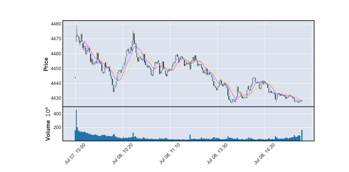
如果你还想给蜡烛上色、想更改线条颜色、想增加其他指标,请看第三部分高级使用。
3.高级使用
上色是非常简单的,正如我们之前换成雅虎配色一样,你只需要添加style参数即可换成我们传统的技术指标颜色。但如果你想自定义颜色也是可以做到的,这里我将前120根柱子设置为蓝黄相间,后120根柱子保留原形:
# 公众号:二七阿尔量化
import pandas as pd
import mplfinance as mpf
mins = pd.read_csv('sh300_1min.csv',index_col=0,parse_dates=True)
mins["day"] = pd.to_datetime(mins["day"])
mins = mins.set_index("day")
mins.index.name = 'Time'
candle_chart = mins.tail(240)
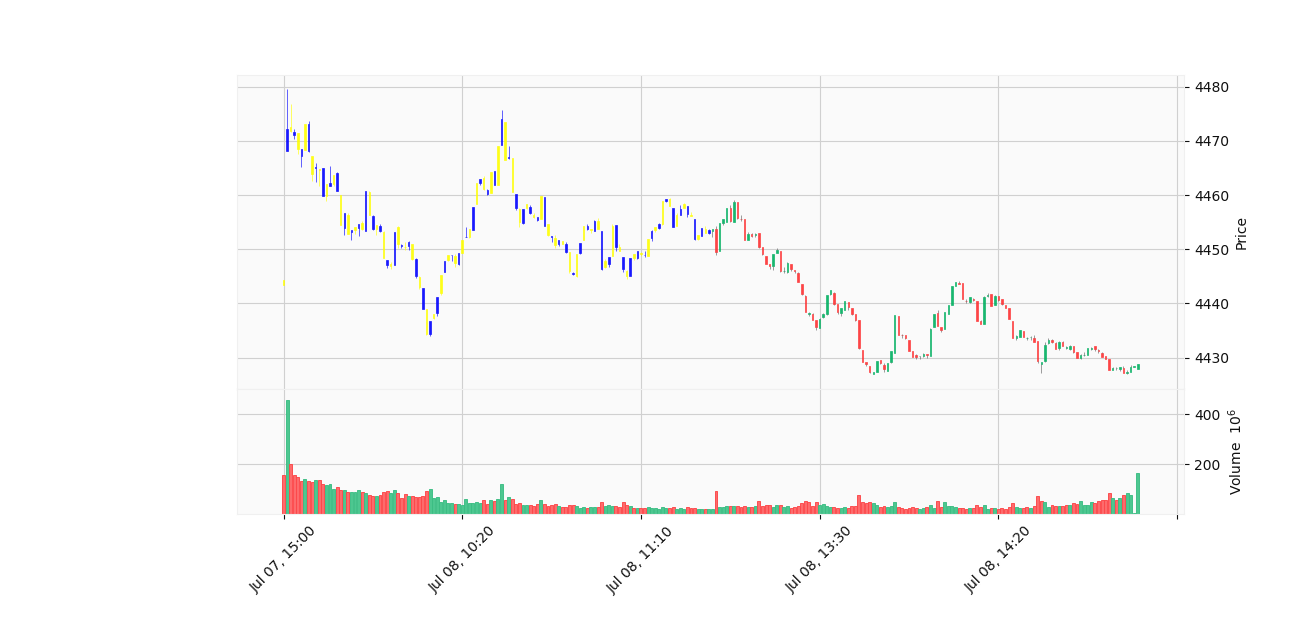
mco = ['yellow','blue'] * 60 + [None] * 120
mpf.plot(candle_chart, volume=True, style='yahoo', type='candle', marketcolor_overrides=mco)效果如下:

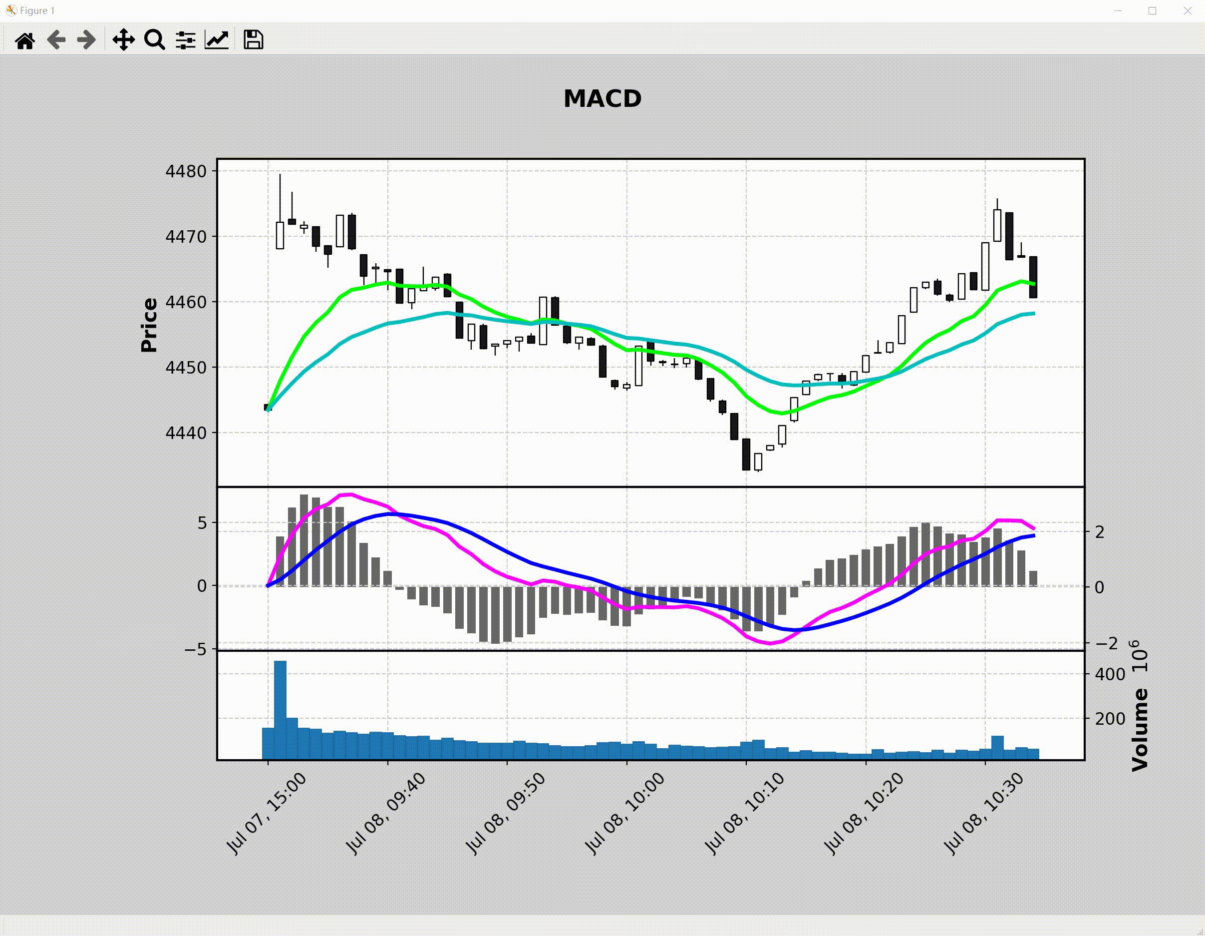
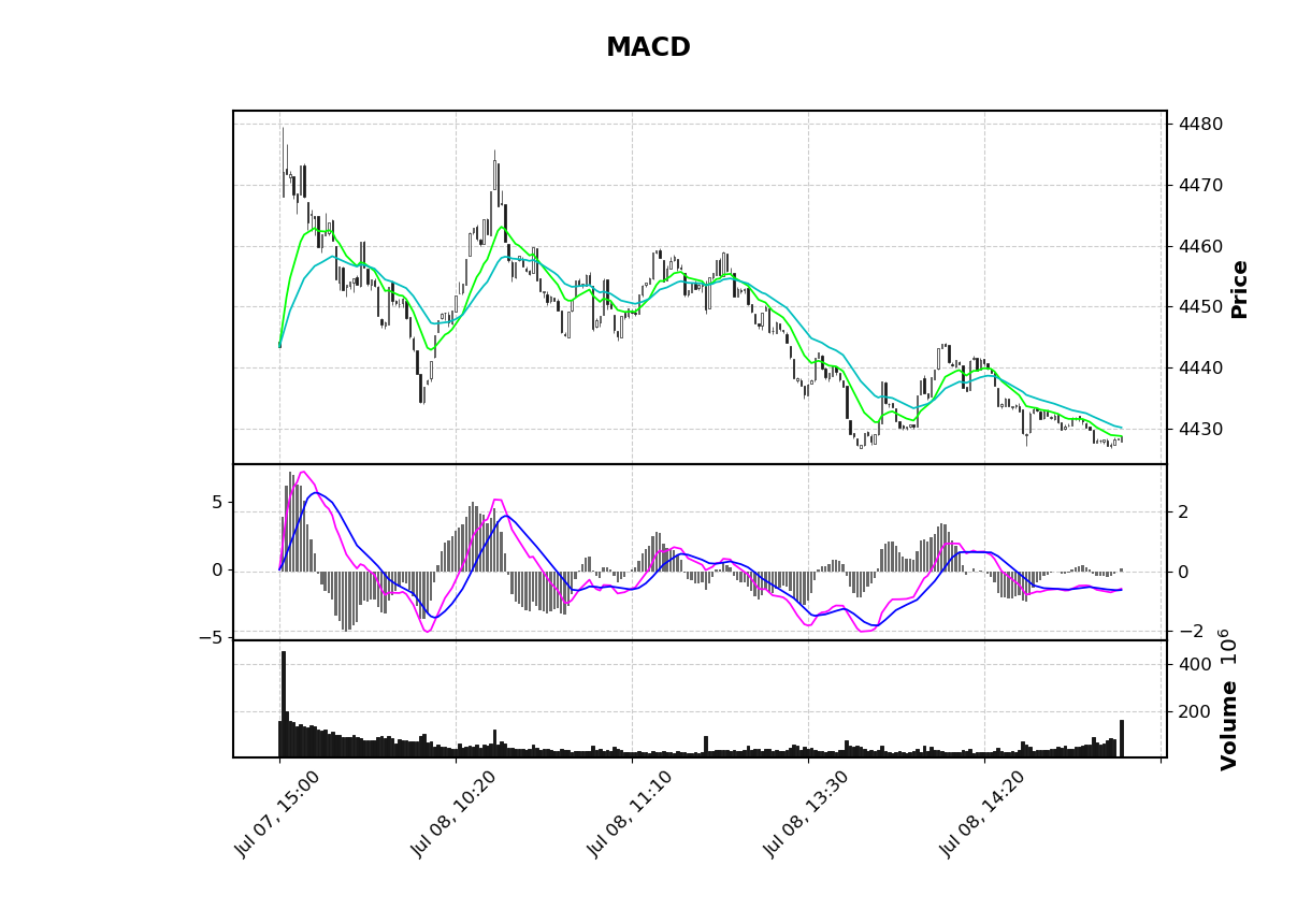
有些同学还希望能够绘制自己的技术指标,mplfinance也可以做到:
# 公众号:二七阿尔量化
# https://github.com/matplotlib/mplfinance/blob/master/examples/mpf_animation_macd.py#L28

import pandas as pd
import mplfinance as mpf
import matplotlib.animation as animation

mins = pd.read_csv('sh300_1min.csv',index_col=0,parse_dates=True)
mins["day"] = pd.to_datetime(mins["day"])
mins = mins.set_index("day")
mins.index.name = 'Time'
candle_chart = mins.tail(240)

df = candle_chart

exp12     = df['close'].ewm(span=12, adjust=False).mean()
exp26     = df['close'].ewm(span=26, adjust=False).mean()
macd      = exp12 - exp26
signal    = macd.ewm(span=9, adjust=False).mean()
histogram = macd - signal

apds = [mpf.make_addplot(exp12,color='lime'),
        mpf.make_addplot(exp26,color='c'),
        mpf.make_addplot(histogram,type='bar',width=0.7,panel=1,
                         color='dimgray',alpha=1,secondary_y=False),
        mpf.make_addplot(macd,panel=1,color='fuchsia',secondary_y=True),
        mpf.make_addplot(signal,panel=1,color='b',secondary_y=True),
       ]

s = mpf.make_mpf_style(base_mpf_style='classic',rc={'figure.facecolor':'lightgray'})

fig, axes = mpf.plot(df,type='candle',addplot=apds,figscale=1.5,figratio=(7,5),title='\n\nMACD',
                     style=s,volume=True,volume_panel=2,panel_ratios=(6,3,2),returnfig=True)

mpf.show()
mpf.make_addplot 支持添加任意图形到任意panel上,panel参数默认为0,如果设为1则将图形添加到第二个图上,color参数能设置图形颜色,secondary_y 能将图形的值设置到y轴上。效果如下:

此外,如果你希望能动态看到整个绘制过程,增加个animation即可:
# 公众号:二七阿尔量化
import pandas as pd
import mplfinance as mpf
import matplotlib.animation as animation

mins = pd.read_csv('sh300_1min.csv',index_col=0,parse_dates=True)
mins["day"] = pd.to_datetime(mins["day"])
mins = mins.set_index("day")
mins.index.name = 'Time'
candle_chart = mins.tail(240)

df = candle_chart

exp12     = df['close'].ewm(span=12, adjust=False).mean()
exp26     = df['close'].ewm(span=26, adjust=False).mean()
macd      = exp12 - exp26
signal    = macd.ewm(span=9, adjust=False).mean()
histogram = macd - signal

apds = [mpf.make_addplot(exp12,color='lime'),
        mpf.make_addplot(exp26,color='c'),
        mpf.make_addplot(histogram,type='bar',width=0.7,panel=1,
                         color='dimgray',alpha=1,secondary_y=False),
        mpf.make_addplot(macd,panel=1,color='fuchsia',secondary_y=True),
        mpf.make_addplot(signal,panel=1,color='b',secondary_y=True),
       ]

s = mpf.make_mpf_style(base_mpf_style='classic',rc={'figure.facecolor':'lightgray'})

fig, axes = mpf.plot(df,type='candle',addplot=apds,figscale=1.5,figratio=(7,5),title='\n\nMACD',
                     style=s,volume=True,volume_panel=2,panel_ratios=(6,3,2),returnfig=True)

mpf.show()

ax_main = axes[0]
ax_emav = ax_main
ax_hisg = axes[2]
ax_macd = axes[3]
ax_sign = ax_macd
ax_volu = axes[4]


def animate(ival):
    if (20+ival) > len(df):
        print('no more data to plot')
        ani.event_source.interval *= 3
        if ani.event_source.interval > 12000:
            exit()
        return
    data = df.iloc[0:(30+ival)]
    exp12     = data['close'].ewm(span=12, adjust=False).mean()
    exp26     = data['close'].ewm(span=26, adjust=False).mean()
    macd      = exp12 - exp26
    signal    = macd.ewm(span=9, adjust=False).mean()
    histogram = macd - signal
    apds = [mpf.make_addplot(exp12,color='lime',ax=ax_emav),
            mpf.make_addplot(exp26,color='c',ax=ax_emav),
            mpf.make_addplot(histogram,type='bar',width=0.7,
                             color='dimgray',alpha=1,ax=ax_hisg),
            mpf.make_addplot(macd,color='fuchsia',ax=ax_macd),
            mpf.make_addplot(signal,color='b',ax=ax_sign),
           ]

    for ax in axes:
        ax.clear()
    mpf.plot(data,type='candle',addplot=apds,ax=ax_main,volume=ax_volu)

ani = animation.FuncAnimation(fig,animate,interval=100)

mpf.show()
还有许多更有趣的玩法,你可以阅读mplfinance的examples学习更多的使用技巧:
https://github.com/matplotlib/mplfinance/tree/master/examples
本文的全部代码和数据包括mplfinance的examples都可以在【二七阿尔量化】公众号后台回复:mplfinance 下载。
我们的文章到此就结束啦,如果你喜欢今天的 Python 教程,请持续关注Python实用宝典。
有任何问题,可以在公众号后台回复:加群,回答相应验证信息,进入互助群询问。
原创不易,希望你能在下面点个赞和在看支持我继续创作,谢谢!
Python实用宝典 ( pythondict.com )
不只是一个宝典
欢迎关注公众号:Python实用宝典


快一年没关注python实用宝典了,今天突然想起来打开,内容还是一如既往的优秀!
站长加油,这么好的站一定要坚持下去!!!
谢谢
为什么使用mpf.plot命令会报错呢,TypeError: ufunc ‘isnan’ not supported for the input types, and the inputs could not be safely coerced to any supported types according to the casting rule ”safe”
参考:https://stackoverflow.com/questions/52657223/typeerror-ufunc-isnan-not-supported-for-the-input-types-and-the-inputs-could