1.题目背景
越来越多的客户不再使用信用卡服务,银行的经理对此感到不安。如果有人能为他们预测哪些客户即将流失,他们将不胜感激,因为这样他们可以主动向客户提供更好的服务,并挽回这些即将流失的客户。
2.数据集
该数据集由10,000个客户组成,其中包含了他们的年龄,工资,婚姻状况,信用卡限额,信用卡类别等。
不过,这里面只有16%的客户是流失的,因此拿来预测客户是否会流失有点难度。
在Python实用宝典后台回复 预测客户流失 下载这份数据和源代码。
译自kaggle并对原文进行了修改和补充,感谢原作者:
https://www.kaggle.com/thomaskonstantin/bank-churn-data-exploration-and-churn-prediction/
3.代码与分析
开始之前,你要确保Python和pip已经成功安装在电脑上,如果没有,请访问这篇文章:超详细Python安装指南 进行安装。如果你用Python的目的是数据分析,可以直接安装Anaconda:Python数据分析与挖掘好帮手—Anaconda,它内置了Python和pip.
此外,推荐大家用VSCode编辑器,因为它可以在编辑器下方的终端运行命令安装依赖模块:Python 编程的最好搭档—VSCode 详细指南。
本文具备流程性,建议使用 VSCode 的 Jupiter Notebook 扩展,新建一个名为 test.ipynb 的文件,跟着教程一步步走下去。


Windows环境下打开Cmd(开始—运行—CMD),苹果系统环境下请打开Terminal(command+空格输入Terminal),准备开始输入命令安装依赖。
所需依赖:
pip install numpy
pip install pandas
pip install plotly
pip install scikit-learn
pip install scikit-plot

# 这个需要conda
conda install -c conda-forge imbalanced-learn
3.1 导入需要的模块
import numpy as np # linear algebra
import pandas as pd # data processing, CSV file I/O (e.g. pd.read_csv)
import matplotlib.pyplot as plt
import seaborn as sns
import plotly.express as ex
import plotly.graph_objs as go
import plotly.figure_factory as ff
from plotly.subplots import make_subplots
import plotly.offline as pyo
pyo.init_notebook_mode()
sns.set_style('darkgrid')
from sklearn.decomposition import PCA
from sklearn.model_selection import train_test_split,cross_val_score
from sklearn.ensemble import RandomForestClassifier,AdaBoostClassifier
from sklearn.svm import SVC
from sklearn.pipeline import Pipeline
from sklearn.preprocessing import StandardScaler
from sklearn.metrics import f1_score as f1
from sklearn.metrics import confusion_matrix
import scikitplot as skplt

plt.rc('figure',figsize=(18,9))
%pip install imbalanced-learn
from imblearn.over_sampling import SMOTE
遇到任何 No module named “XXX” 都可以尝试pip install一下。
如果pip install没解决,可以谷歌/百度一下,看看别人是怎么解决的。
3.2 加载数据
c_data = pd.read_csv('./BankChurners.csv')
c_data = c_data[c_data.columns[:-2]]
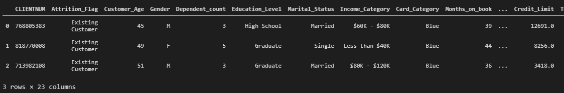
c_data.head(3)这里去掉了最后两列的朴素贝叶斯分类结果。
显示前三行数据, 可以看到所有的字段:

3.3 探索性数据分析
下面看看这20+列数据中,哪一些是对我们有用的。
首先,我想知道数据集中的客户年龄分布:
fig = make_subplots(rows=2, cols=1)

tr1=go.Box(x=c_data['Customer_Age'],name='Age Box Plot',boxmean=True)
tr2=go.Histogram(x=c_data['Customer_Age'],name='Age Histogram')

fig.add_trace(tr1,row=1,col=1)
fig.add_trace(tr2,row=2,col=1)

fig.update_layout(height=700, width=1200, title_text="Distribution of Customer Ages")
fig.show()

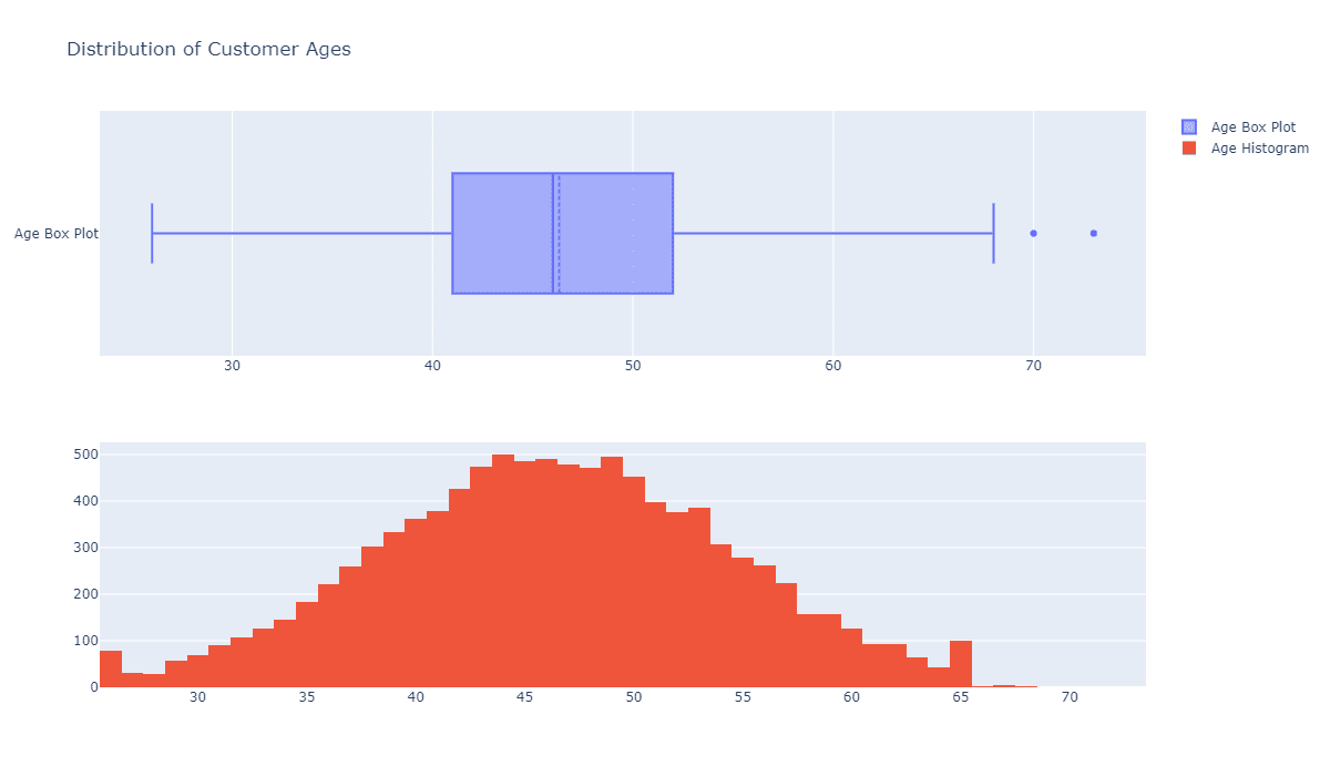
可以看到,客户的年龄分布大致遵循正态分布,因此使用可以在正态假设下进一步使用年龄特征。
同样滴,我想知道性别分布如何:
ex.pie(c_data,names='Gender',title='Propotion Of Customer Genders')


可见,在我们的数据集中,女性的样本比男性更多,但是差异的百分比不是那么显著,所以我们可以说性别是均匀分布的。
每个客户的家庭人数的分布怎么样?
fig = make_subplots(rows=2, cols=1)

tr1=go.Box(x=c_data['Dependent_count'],name='Dependent count Box Plot',boxmean=True)
tr2=go.Histogram(x=c_data['Dependent_count'],name='Dependent count Histogram')

fig.add_trace(tr1,row=1,col=1)
fig.add_trace(tr2,row=2,col=1)

fig.update_layout(height=700, width=1200, title_text="Distribution of Dependent counts (close family size)")
fig.show()
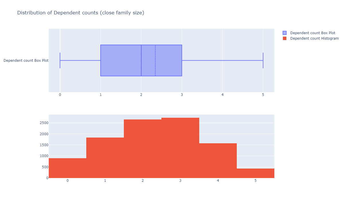
可见,它也是大致符合正态分布的,偏右一点。
客户的受教育水平如何?
ex.pie(c_data,names='Education_Level',title='Propotion Of Education Levels')

假设大多数教育程度不明(Unknown)的顾客都没有接受过任何教育。我们可以指出,超过70%的顾客都受过正规教育,其中约35%的人受教育程度达到硕士以上水平,45%的人达到本科以上水准。
他们的婚姻状态如何?
ex.pie(c_data,names='Marital_Status',title='Propotion Of Different Marriage Statuses')
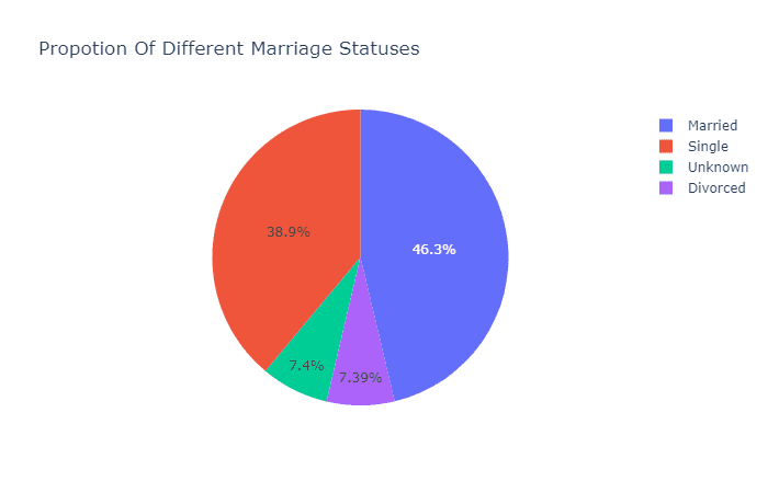
看来,这家银行几乎一半的客户都是已婚人士,有趣的是,另一半客户几乎都是单身人士,另外只有7%的客户离婚了。
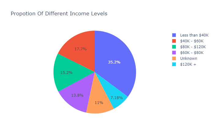
看看收入分布和卡片类型的分布:
ex.pie(c_data,names='Income_Category',title='Propotion Of Different Income Levels')
ex.pie(c_data,names='Card_Category',title='Propotion Of Different Card Categories')
可见大部分人的年收入处于60K美元以下。

在持有的卡片的类型上,蓝卡占了绝大多数。
每月账单数量有没有特征?
fig = make_subplots(rows=2, cols=1)

tr1=go.Box(x=c_data['Months_on_book'],name='Months on book Box Plot',boxmean=True)
tr2=go.Histogram(x=c_data['Months_on_book'],name='Months on book Histogram')

fig.add_trace(tr1,row=1,col=1)
fig.add_trace(tr2,row=2,col=1)

fig.update_layout(height=700, width=1200, title_text="Distribution of months the customer is part of the bank")
fig.show()
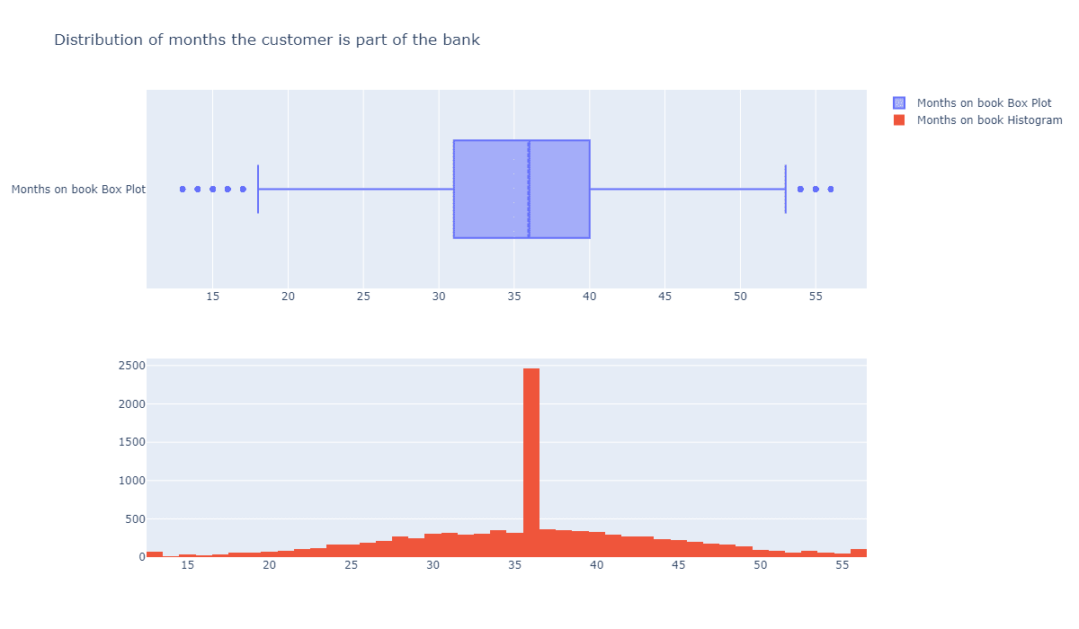
可以看到中间的峰值特别高,显然这个指标不是正态分布的。
每位客户持有的银行业务数量有没有特征呢?
fig = make_subplots(rows=2, cols=1)

tr1=go.Box(x=c_data['Total_Relationship_Count'],name='Total no. of products Box Plot',boxmean=True)
tr2=go.Histogram(x=c_data['Total_Relationship_Count'],name='Total no. of products Histogram')

fig.add_trace(tr1,row=1,col=1)
fig.add_trace(tr2,row=2,col=1)

fig.update_layout(height=700, width=1200, title_text="Distribution of Total no. of products held by the customer")
fig.show()
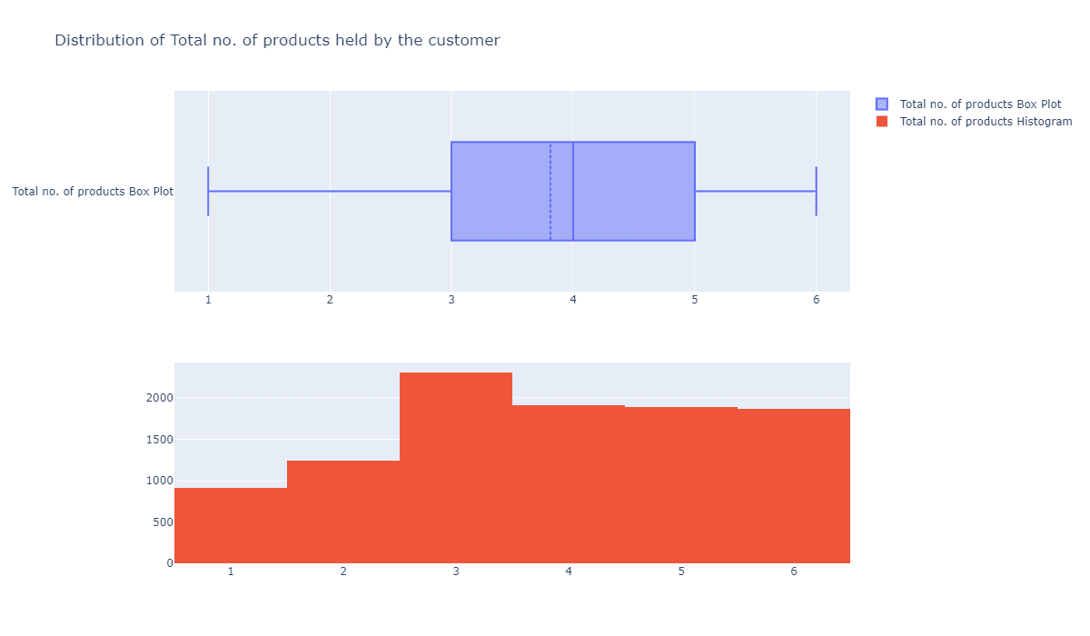
基本上都是均匀分布的,显然这个指标对于我们而言也没太大意义。
用户不活跃月份数量有没有好用的特征?
fig = make_subplots(rows=2, cols=1)

tr1=go.Box(x=c_data['Months_Inactive_12_mon'],name='number of months inactive Box Plot',boxmean=True)
tr2=go.Histogram(x=c_data['Months_Inactive_12_mon'],name='number of months inactive Histogram')

fig.add_trace(tr1,row=1,col=1)
fig.add_trace(tr2,row=2,col=1)

fig.update_layout(height=700, width=1200, title_text="Distribution of the number of months inactive in the last 12 months")
fig.show()
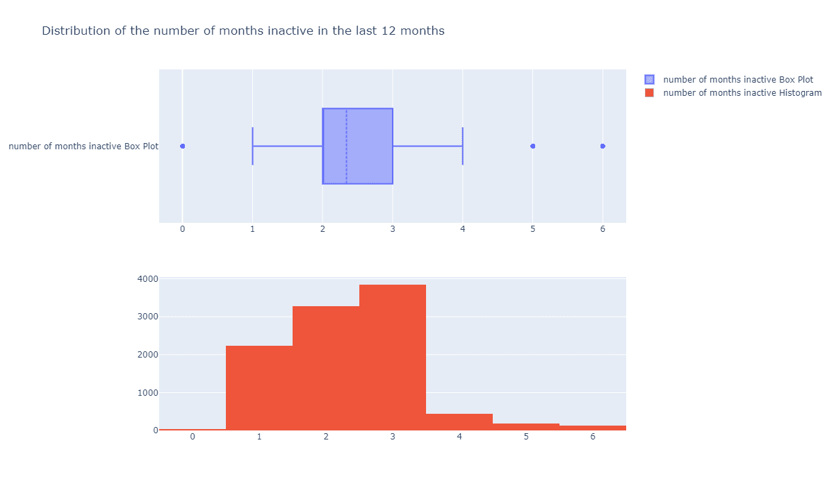
这个似乎有点用处,会不会越不活跃的用户越容易流失呢?
信用卡额度的分布如何?
fig = make_subplots(rows=2, cols=1)

tr1=go.Box(x=c_data['Credit_Limit'],name='Credit_Limit Box Plot',boxmean=True)
tr2=go.Histogram(x=c_data['Credit_Limit'],name='Credit_Limit Histogram')

fig.add_trace(tr1,row=1,col=1)
fig.add_trace(tr2,row=2,col=1)

fig.update_layout(height=700, width=1200, title_text="Distribution of the Credit Limit")
fig.show()
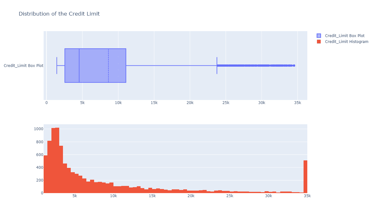
大部分人的额度都在0到10k之间,这比较正常,暂时看不出和流失有什么关系。
客户总交易额的分布怎么样?
fig = make_subplots(rows=2, cols=1)

tr1=go.Box(x=c_data['Total_Trans_Amt'],name='Total_Trans_Amt Box Plot',boxmean=True)
tr2=go.Histogram(x=c_data['Total_Trans_Amt'],name='Total_Trans_Amt Histogram')

fig.add_trace(tr1,row=1,col=1)
fig.add_trace(tr2,row=2,col=1)

fig.update_layout(height=700, width=1200, title_text="Distribution of the Total Transaction Amount (Last 12 months)")
fig.show()
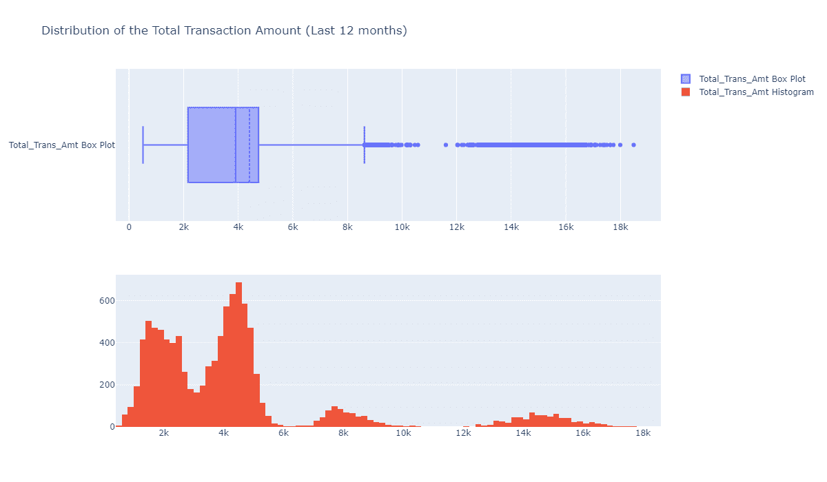
这个有点意思,总交易额的分布体现出“多组”分布,如果我们根据这个指标将客户聚类为不同的组别,看他们之间的相似性,并作出不同的画线,也许对我们最终的流失分析有一定的意义。
接下来,最重要的流失用户分布:
ex.pie(c_data,names='Attrition_Flag',title='Proportion of churn vs not churn customers')
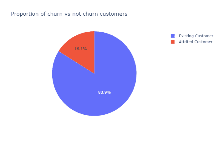
我们可以看到,只有16%的数据样本代表流失客户,在接下来的步骤中,我将使用SMOTE对流失样本进行采样,使其与常规客户的样本大小匹配,以便给后面选择的模型一个更好的机会来捕捉小细节。
3.4 数据预处理
使用SMOTE模型前,需要根据不同的特征对数据进行One Hot编码:
c_data.Attrition_Flag = c_data.Attrition_Flag.replace({'Attrited Customer':1,'Existing Customer':0})
c_data.Gender = c_data.Gender.replace({'F':1,'M':0})
c_data = pd.concat([c_data,pd.get_dummies(c_data['Education_Level']).drop(columns=['Unknown'])],axis=1)
c_data = pd.concat([c_data,pd.get_dummies(c_data['Income_Category']).drop(columns=['Unknown'])],axis=1)
c_data = pd.concat([c_data,pd.get_dummies(c_data['Marital_Status']).drop(columns=['Unknown'])],axis=1)
c_data = pd.concat([c_data,pd.get_dummies(c_data['Card_Category']).drop(columns=['Platinum'])],axis=1)
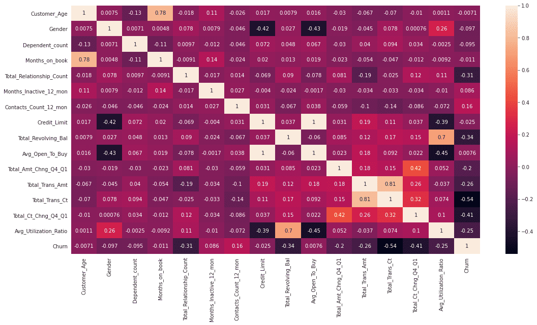
c_data.drop(columns = ['Education_Level','Income_Category','Marital_Status','Card_Category','CLIENTNUM'],inplace=True)显示热力图:
sns.heatmap(c_data.corr('pearson'),annot=True)

3.5 SMOTE模型采样
SMOTE模型经常用于解决数据不平衡的问题,它通过添加生成的少数类样本改变不平衡数据集的数据分布,是改善不平衡数据分类模型性能的流行方法之一。
oversample = SMOTE()
X, y = oversample.fit_resample(c_data[c_data.columns[1:]], c_data[c_data.columns[0]])
usampled_df = X.assign(Churn = y)
ohe_data =usampled_df[usampled_df.columns[15:-1]].copy()
usampled_df = usampled_df.drop(columns=usampled_df.columns[15:-1])
sns.heatmap(usampled_df.corr('pearson'),annot=True)
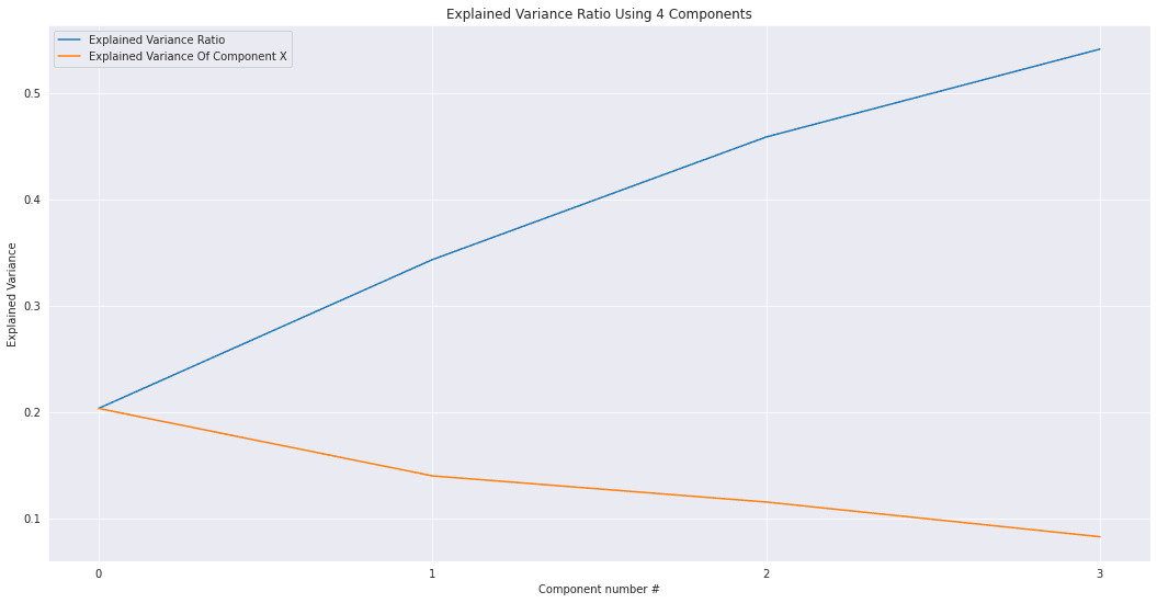
3.6 主成分分析
我们将使用主成分分析来降低单次编码分类变量的维数,从而降低方差。同时使用几个主成分而不是几十个单次编码特征将帮助我构建一个更好的模型。
N_COMPONENTS = 4

pca_model = PCA(n_components = N_COMPONENTS )

pc_matrix = pca_model.fit_transform(ohe_data)

evr = pca_model.explained_variance_ratio_
cumsum_evr = np.cumsum(evr)

ax = sns.lineplot(x=np.arange(0,len(cumsum_evr)),y=cumsum_evr,label='Explained Variance Ratio')
ax.set_title('Explained Variance Ratio Using {} Components'.format(N_COMPONENTS))
ax = sns.lineplot(x=np.arange(0,len(cumsum_evr)),y=evr,label='Explained Variance Of Component X')
ax.set_xticks([i for i in range(0,len(cumsum_evr))])
ax.set_xlabel('Component number #')
ax.set_ylabel('Explained Variance')
plt.show()
usampled_df_with_pcs = pd.concat([usampled_df,pd.DataFrame(pc_matrix,columns=['PC-{}'.format(i) for i in range(0,N_COMPONENTS)])],axis=1)
usampled_df_with_pcs

特征变得越来越明显:
sns.heatmap(usampled_df_with_pcs.corr('pearson'),annot=True)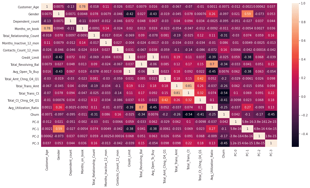
4.模型选择及测试
选择出以下特征划分训练集并进行训练:
X_features = ['Total_Trans_Ct','PC-3','PC-1','PC-0','PC-2','Total_Ct_Chng_Q4_Q1','Total_Relationship_Count']

X = usampled_df_with_pcs[X_features]
y = usampled_df_with_pcs['Churn']

train_x,test_x,train_y,test_y = train_test_split(X,y,random_state=42)
4.1 交叉验证
分别看看随机森林、AdaBoost和SVM模型三种模型的表现如何:
rf_pipe = Pipeline(steps =[ ('scale',StandardScaler()), ("RF",RandomForestClassifier(random_state=42)) ])
ada_pipe = Pipeline(steps =[ ('scale',StandardScaler()), ("RF",AdaBoostClassifier(random_state=42,learning_rate=0.7)) ])
svm_pipe = Pipeline(steps =[ ('scale',StandardScaler()), ("RF",SVC(random_state=42,kernel='rbf')) ])


f1_cross_val_scores = cross_val_score(rf_pipe,train_x,train_y,cv=5,scoring='f1')
ada_f1_cross_val_scores=cross_val_score(ada_pipe,train_x,train_y,cv=5,scoring='f1')
svm_f1_cross_val_scores=cross_val_score(svm_pipe,train_x,train_y,cv=5,scoring='f1')
plt.subplot(3,1,1)
ax = sns.lineplot(x=range(0,len(f1_cross_val_scores)),y=f1_cross_val_scores)
ax.set_title('Random Forest Cross Val Scores')
ax.set_xticks([i for i in range(0,len(f1_cross_val_scores))])
ax.set_xlabel('Fold Number')
ax.set_ylabel('F1 Score')
plt.show()
plt.subplot(3,1,2)
ax = sns.lineplot(x=range(0,len(ada_f1_cross_val_scores)),y=ada_f1_cross_val_scores)
ax.set_title('Adaboost Cross Val Scores')
ax.set_xticks([i for i in range(0,len(ada_f1_cross_val_scores))])
ax.set_xlabel('Fold Number')
ax.set_ylabel('F1 Score')
plt.show()
plt.subplot(3,1,3)
ax = sns.lineplot(x=range(0,len(svm_f1_cross_val_scores)),y=svm_f1_cross_val_scores)
ax.set_title('SVM Cross Val Scores')
ax.set_xticks([i for i in range(0,len(svm_f1_cross_val_scores))])
ax.set_xlabel('Fold Number')
ax.set_ylabel('F1 Score')
plt.show()看看三种模型都有什么不同的表现:


看得出来随机森林 F1分数是最高的。
4.2 模型预测
对测试集进行预测,看看三种模型的效果:
rf_pipe.fit(train_x,train_y)
rf_prediction = rf_pipe.predict(test_x)

ada_pipe.fit(train_x,train_y)
ada_prediction = ada_pipe.predict(test_x)

svm_pipe.fit(train_x,train_y)
svm_prediction = svm_pipe.predict(test_x)

print('F1 Score of Random Forest Model On Test Set - {}'.format(f1(rf_prediction,test_y)))
print('F1 Score of AdaBoost Model On Test Set - {}'.format(f1(ada_prediction,test_y)))
print('F1 Score of SVM Model On Test Set - {}'.format(f1(svm_prediction,test_y)))

4.3 对原始数据(采样前)进行模型预测
接下来对原始数据进行模型预测:
ohe_data =c_data[c_data.columns[16:]].copy()
pc_matrix = pca_model.fit_transform(ohe_data)
original_df_with_pcs = pd.concat([c_data,pd.DataFrame(pc_matrix,columns=['PC-{}'.format(i) for i in range(0,N_COMPONENTS)])],axis=1)

unsampled_data_prediction_RF = rf_pipe.predict(original_df_with_pcs[X_features])
unsampled_data_prediction_ADA = ada_pipe.predict(original_df_with_pcs[X_features])
unsampled_data_prediction_SVM = svm_pipe.predict(original_df_with_pcs[X_features])
效果如下:

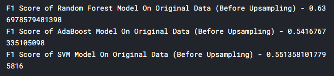
F1最高的随机森林模型有0.63分,偏低,这也比较正常,毕竟在这种分布不均的数据集中,查全率是很难做到很高的。
4.4 结果
让我们看看最终在原数据上使用随机森林模型的运行结果:
ax = sns.heatmap(confusion_matrix(unsampled_data_prediction_RF,original_df_with_pcs['Attrition_Flag']),annot=True,cmap='coolwarm',fmt='d')
ax.set_title('Prediction On Original Data With Random Forest Model Confusion Matrix')
ax.set_xticklabels(['Not Churn','Churn'],fontsize=18)
ax.set_yticklabels(['Predicted Not Churn','Predicted Churn'],fontsize=18)

plt.show()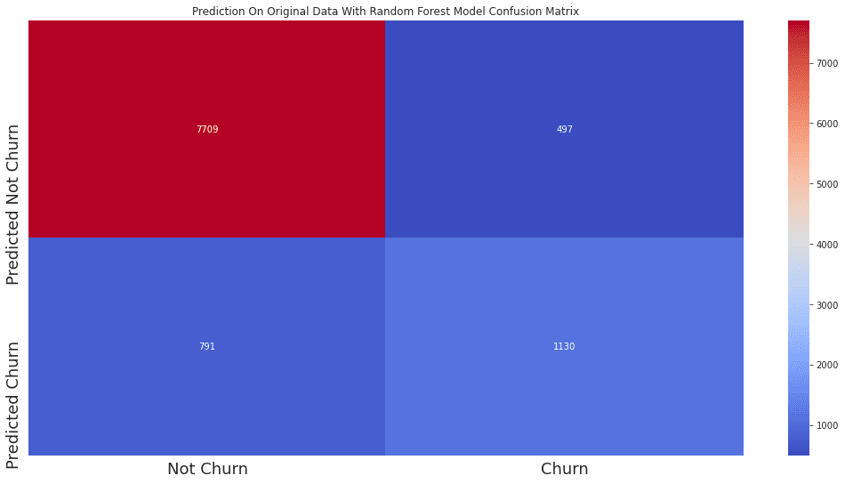
可见,没有流失的客户命中了7709人,未命中791人。
流失客户命中了1130人,未命中497人。
整体而言,是一个比较优秀的模型了。
我们的文章到此就结束啦,如果你喜欢今天的 Python 教程,请持续关注Python实用宝典。
有任何问题,可以在公众号后台回复:加群,回答相应验证信息,进入互助群询问。
原创不易,希望你能在下面点个赞和在看支持我继续创作,谢谢!
Python实用宝典 ( pythondict.com )
不只是一个宝典
欢迎关注公众号:Python实用宝典